HomeBeat
Web and mobile applications that motivate users to save on utility costs and conserve energy, by providing personalized usage insights.
Team
2 contract designers, 3 Product Managers, 4 Data Scientists, 15+ engineering team.
Role
Lead Designer. I drove overall design strategy and end-end design across product and marketing.
Timeline
We were releasing every 2 weeks.
Challenge
Bidgely was finding it hard to sell it’s web and mobile based solutions to utilities, due to the lower user retention and engagement in the products. People do not think about their utility consumption, in fact a study shows that an average american thinks of their utility consumption only 7mins in a whole year. With this, it was getting difficult for Bidgely to engage customers in a meaningful way.
Moreover, this was the first design hire for Bidgely. Till now, they had worked with a number of contractors, resulting in a uncoordinated design language. One of my challenge was to design each touchpoint that customers have with the company and create a consistent brand for an upcoming startup.
Approach
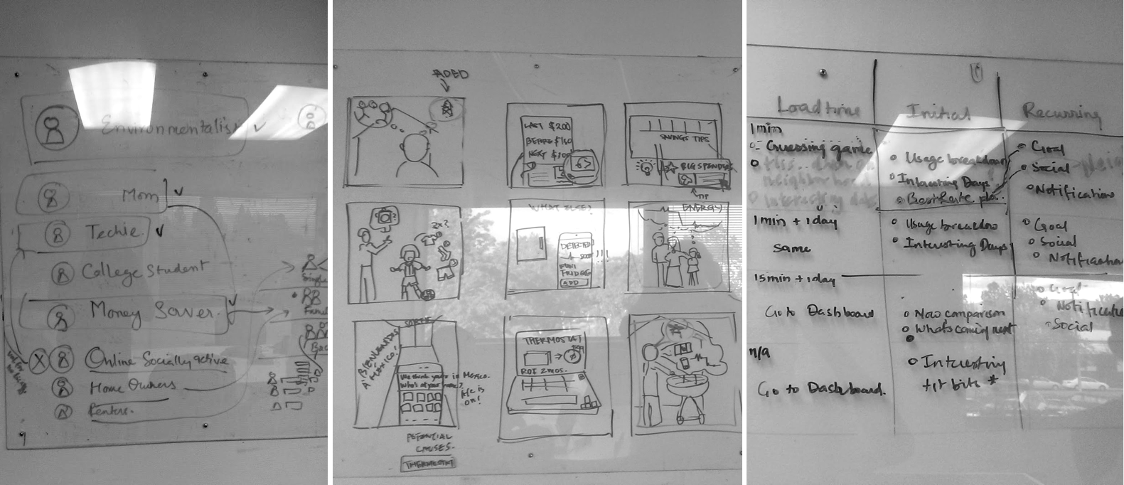
As I joined the Bidgely team, I heard a lot of different assumptions about the user base that the company was targeting and the value propositions they were providing. For starters, I wanted to get those assumptions out and create alignment within the teams, and especially the stakeholders. I spent my second week at work with the stakeholders to document personas, storyboards and a journey maps based on internal knowledge as well as the telemetry data to support that assumption.
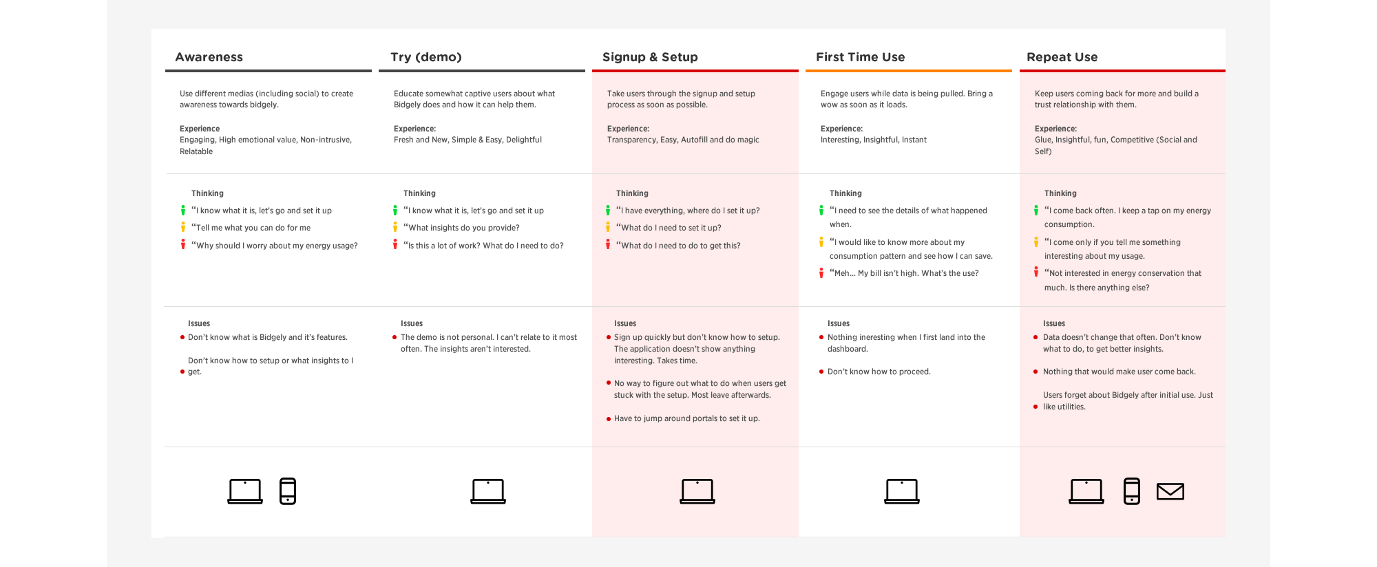
Customer Journey
Once we had an alignment on the set goals for these products, I started putting the end-to-end journey that user takes with Bidgely products along with the telemetry data for each of the phases. We noticed a big drop in setup. Most of the users could not successfully setup their energy devices. Users didn't seem to get valuable out of the application, and often dropped out of the application. A cohort analysis showed that the engagement dropped after a week. Althought Bidgely had a small energy enthusiast group that was using the application. As we were getting feedback from this group, the application was becoming aligned to the needs of this group, while ignoring rest of the probable users.
Design
Bidgely was entering the energy monitor hardware market and releasing it's own version. Along with this, we wanted to make sure the application suite is ready for this launch. We were already in discussions with some of the utilities to distribute the energy monitors to their customers. This would mean that we get to reach to a newer customers base.
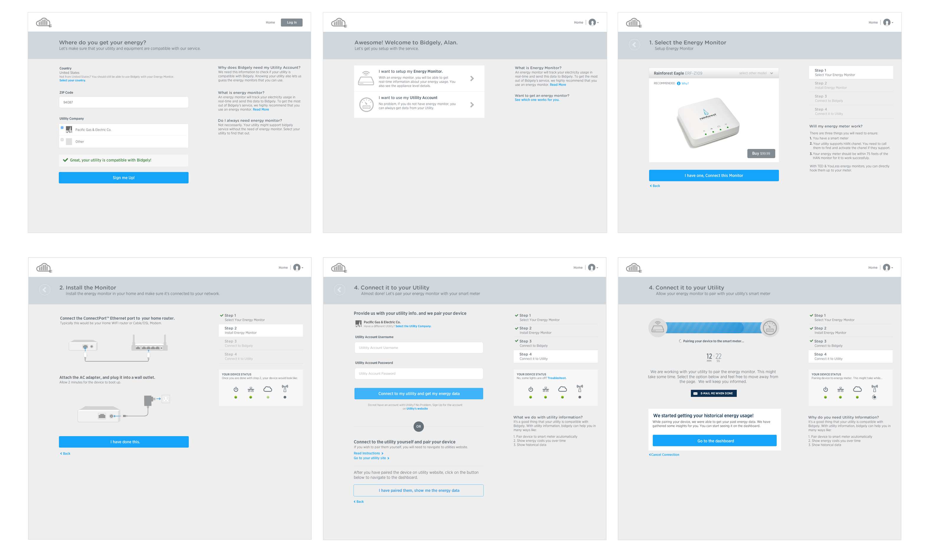
Onboarding
As we had identified issues with energy monitor setup, we wanted to address that, so that the launch of the new device goes smooth. The implemented version of signup-setup, pushed the setup in the setting section of the application. The workflow was optimized to signup quickly and reduce the time to value, without the optional setup. I took a step back to look at all the steps needed to setup the energy monitor, including the ones that needed users to go to utility sites. My suggestion was to keep the setup upfront as part of initial onboarding process.
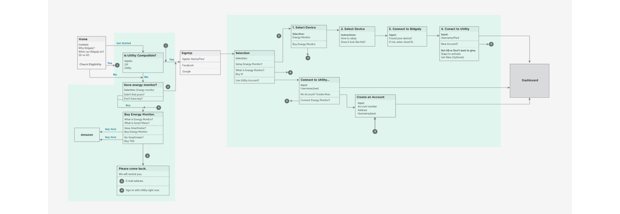
I drove daily standup meeting around the new proposal that included the UI lead, PM lead and a backend engineer to go over the workflows and discuss implementation, or any design issues. Our goal was to provide personalized setup experience to the users. We created custom illustrations and instructions for each device we were supporting. We also wanted to optimize on the portal jumps or the wait time user has to spend in order to setup the device. We were able to bring down the setup time from ~18 hours to 15 minutes by talking to the utility approvers. We scrapped user data from their account to make the signup automatic and any failure would result in an e-mail to the team members, who would go and signup on user's behalf. User's would get an automated e-mail as soon as the device was ready to use.
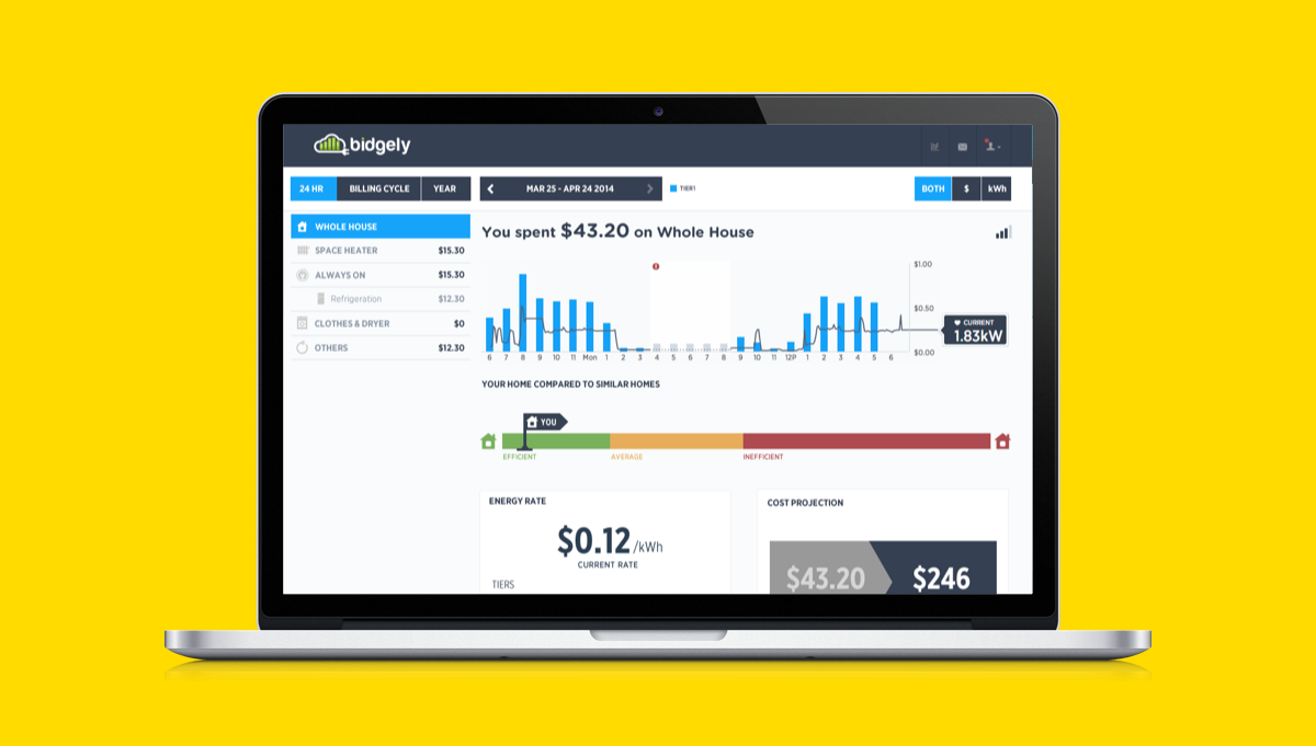
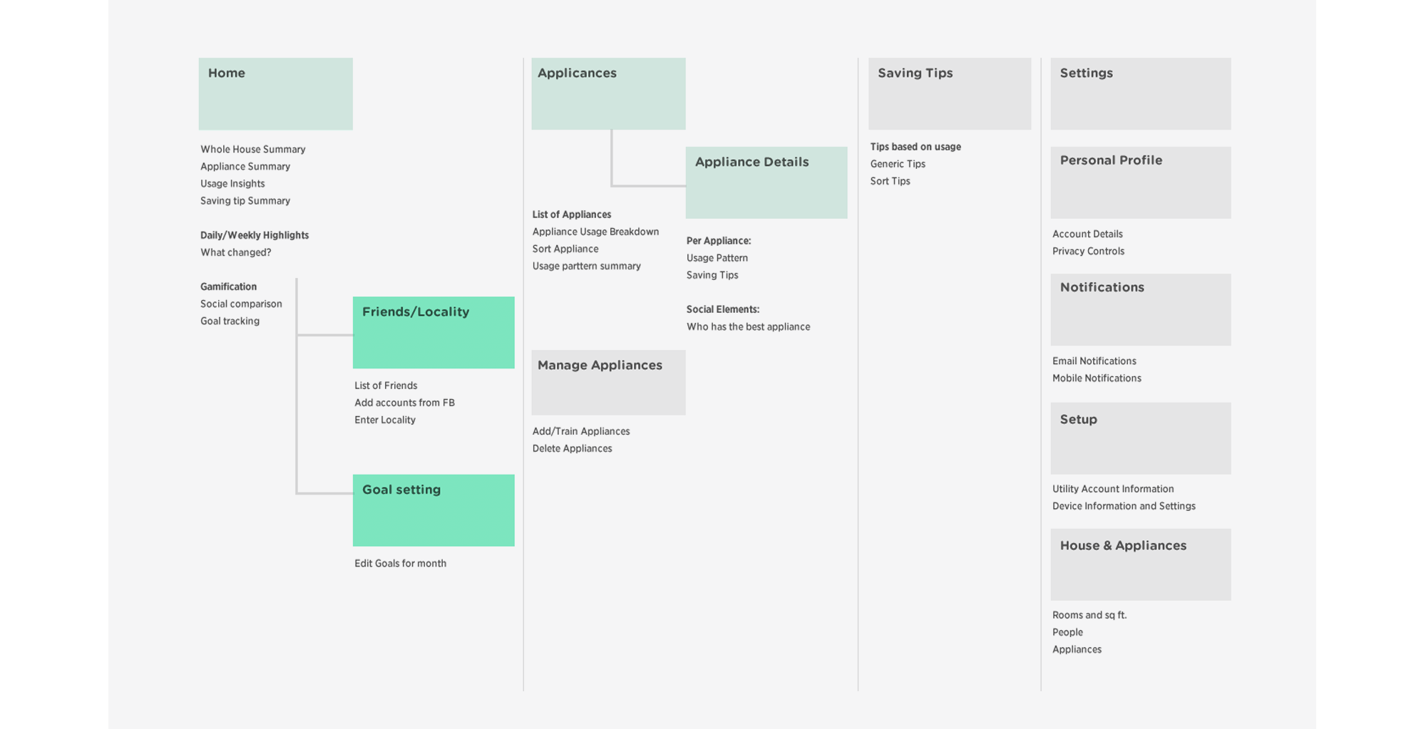
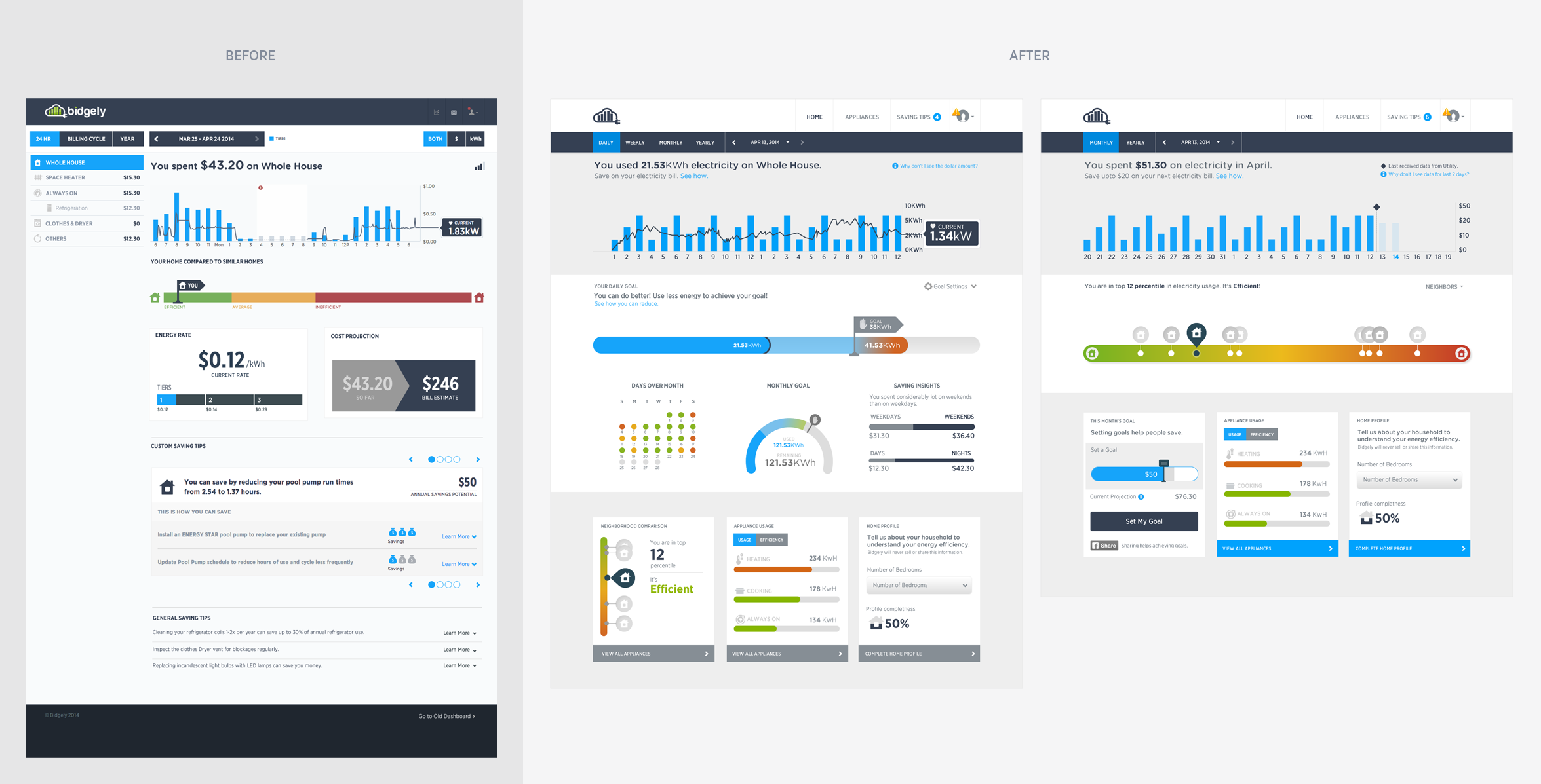
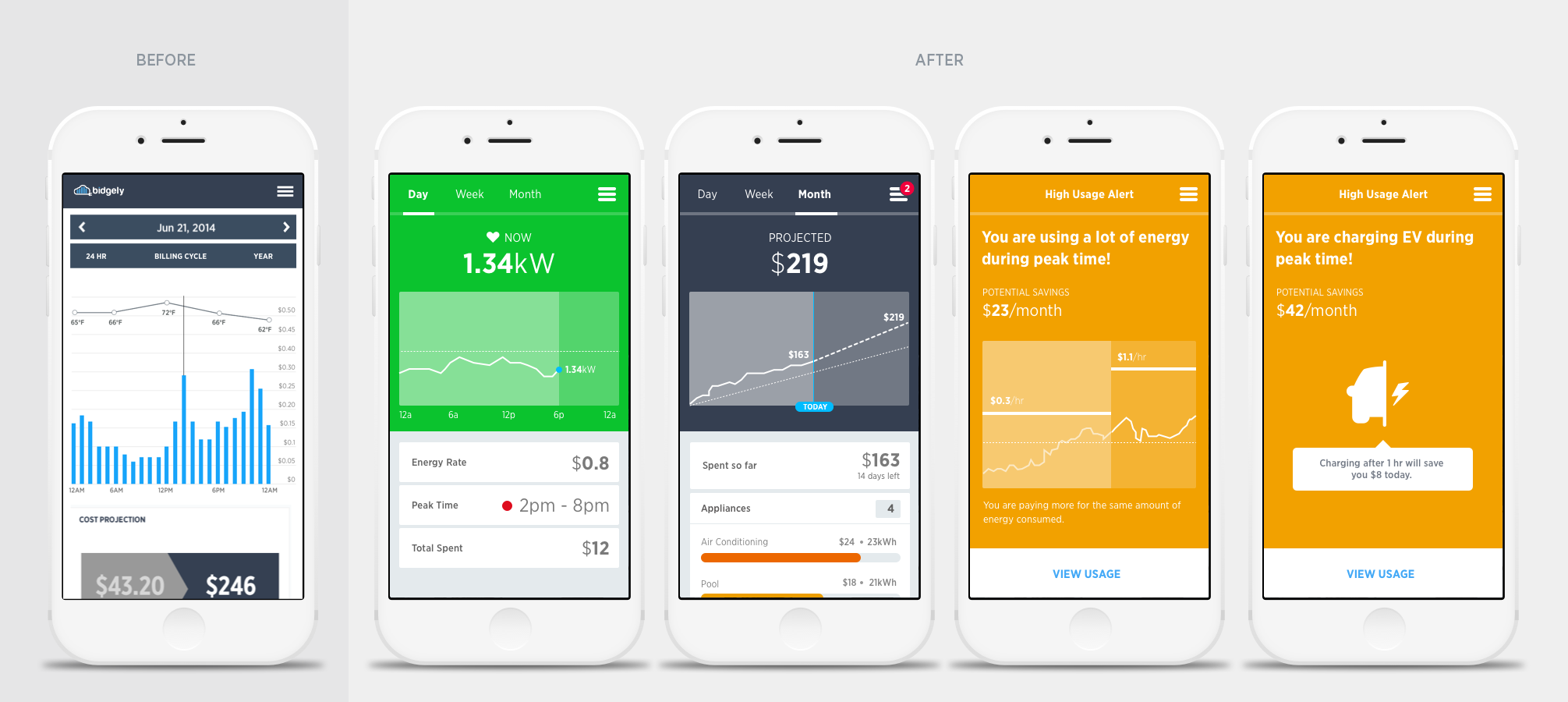
Dashboard Engagement
Dashboard was a key element in improving the overall engagement and improve the overall image of the company. This was the first touchpoint that the user had after the setup. We knew that users are not getting engaged.
Hey there, this is the default text for a new paragraph. Feel free to edit this paragraph by clicking on the yellow edit icon. After you are done just click on the yellow checkmark button on the top right. Have Fun!
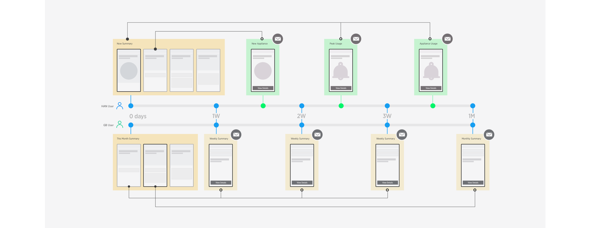
Mobile and E-mail Engagement
A good place to start was understanding trust building between humans. There were key insights that were applicable to the human-technology trust.
Hey there, this is the default text for a new paragraph. Feel free to edit this paragraph by clicking on the yellow edit icon. After you are done just click on the yellow checkmark button on the top right. Have Fun!
Process Highlights
Continuous Development
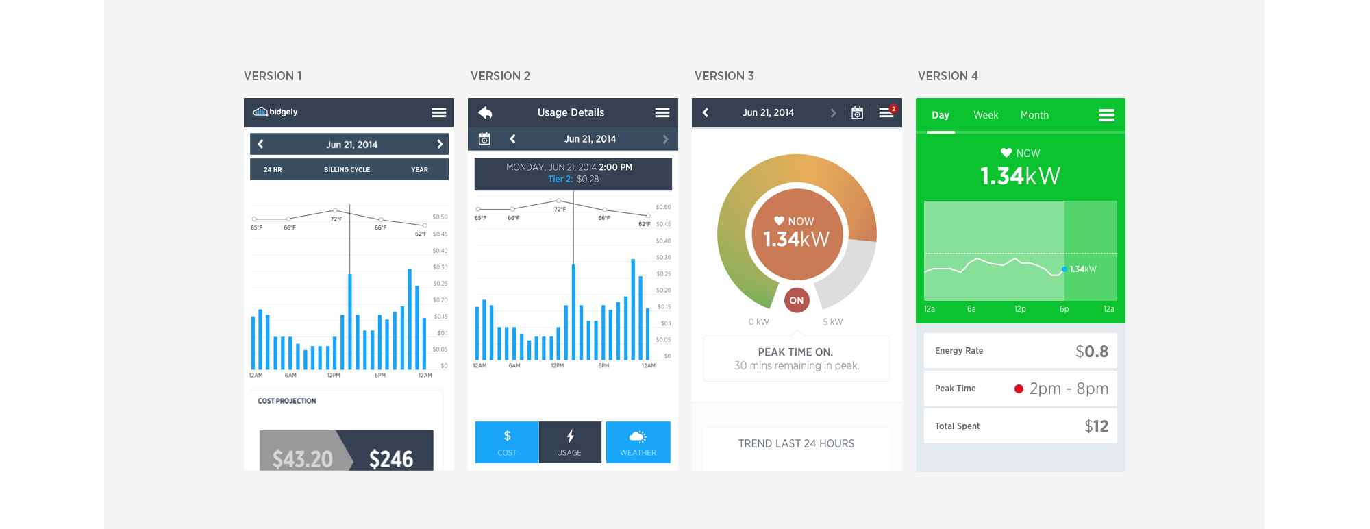
At Bidgely, I pushed for continuous development of the web and mobile apps. Being a startup, we wanted to show results soon and measure them as we progressed in a particular direction. This resulted in progressively iterating over designs and validating them every time we made a change. A scrum team would define user goals for a phase of product change, that usually consists of 3-4 sprints. Design presented the high-level vision for the phase and iterated throughout the process.
Customer Experience
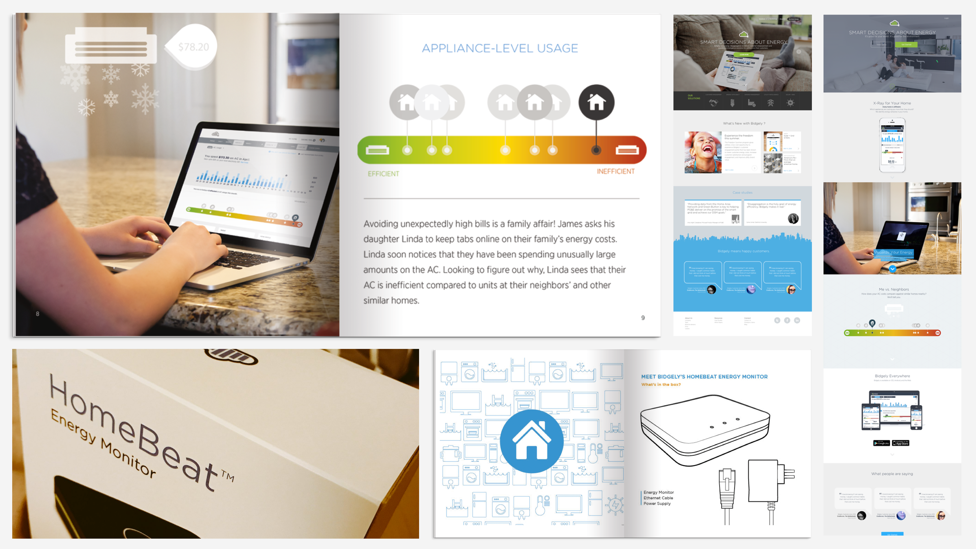
I was focusing not just on the end-end product experience, but on any touchpoints that customer have with Bidgely brand. As in startups, we did not have boundaries between the teams, and I was using this to provide a consistent experience and brand image across all the medias. I worked with the marketing team to design marketing materials, marketing website, exhibition panels, product packaging etc.
Impact
Unbounded retention after 1 month increased from 5% to ~14%, . Session interval reduced from 72 days to 23 days. In some pilot studies, around 90% of the signed up customers returned to the platform at least once a week. This was a great imporvement in customer engagement that became an attractive proposition to the utilities.
As a result, Bidgely gained key partnership with three utilities in US. One of the contract demands was to close down the consumer access directly to the Bidgely portal. Sometime in 2015, Bidgely closed down the direct access. User's could access it only if their utility partnered with Bidgely.
App has been getting 4+ ratings at Apple Store. Company has continued to simplify the app experience, removing non-essential data from the applications. The attitude has changed from showing information, to providing right value at right time.
During the pilots, setup rate went up by ~45% and the time reduced from a 3 days to 15 minutes.


